


Ranking MLB’s bold new 2026 City Connect uniforms
MLB is known for its tradition and history, but City Connect jerseys turn that on its head, and baseball is all the better for it. The Nike-made alternate jerseys have been in production since 2021, and eight more teams just announced new City Connect jerseys for the 2026 season. These jerseys are known for their flashy color schemes, bold font choices, and a representation of the cities in which they will be displayed on the diamond. The uniqueness brings new eyes to the sport and adds intrigue amid the mundanity of a 162-game season.
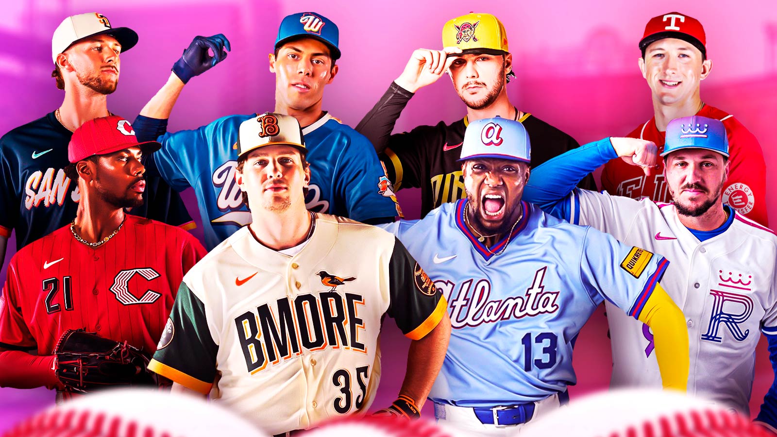
The Atlanta Braves, San Diego Padres, Texas Rangers, Baltimore Orioles, Milwaukee Brewers, Cincinnati Reds, Kansas City Royals, and Pittsburgh Pirates will all sport new threads this year. Fans will not only have a blast seeing these jerseys on their television screens and on their favorite players at the ballpark, but they will also want to get their hands on them in order to display their fandom. City Connect jerseys are available on Fanatics.com.
When teams take bold chances with City Connect jerseys, some uniforms are going to end up better than others, though. Here are all eight new City Connect jerseys ranked from worst to first.
8. Milwaukee Brewers
Are the Brewers located not just in the city of Milwaukee but in the entire state of Wisconsin? Yes. Does that mean that the Brewers needed to put ‘Wisco’ across the chest of their City Connect jerseys? Probably not. While these jerseys rank dead last among the 2026 crop of City Connects, they are far from a bad jersey.
The land of 10,000 lakes is represented here with a soft blue that represents the vastness of H2O in Wisconsin. The arm sleeve and hat logo also combine subtleness with a dose of splash, and it works quite well. Even so, these jerseys are just a lot more bland than the rest on this list, and that isn’t what City Connect is about.
7. San Diego Padres
The San Diego Padres’ first City Connect jerseys, which were vibrant with loud pink and green colors, were beloved by fans and were one of the best jerseys to come out in recent memory. The team missed the mark with their 2.0 iteration. These new jerseys have a color scheme that is reminiscent of the Padres of the ’90s.
They also honor Dia de los Muertos with a La Catrina arm patch, which is the best part of the entire uniform. The floral arm sleeve cuff was a nice touch, too. The white, blue, and orange jerseys aren’t bad; they just leave fans wanting more after the Padres already showcased that they can create some of the most iconic jerseys ever.
6. Texas Rangers
The color red is re-entering the Texas Rangers’ rotation, and a charro pattern instills the Tex-Mex feel the team was going for. Furthermore, the word “Tejas” pans across these City Connect jerseys. The word means Texas in Spanish. These uniforms are simple but effective. The red pops and pairs perfectly with the blocky letter “T” displayed on the team’s caps.
5. Cincinnati Reds
While the Rangers paired their Red tops with white pants, the Cincinnati Reds took that color and exploded it all over the entire uniform. Red jerseys, red pants, and red hats can be a lot to take in, but that should be no surprise for a team whose namesake is literally the color red. The overdose of red is offset by black pinstripes and a white letter “C” logo that is just different enough from the Reds’ normal logo.
4. Atlanta Braves
The Atlanta Braves took inspiration from their ’80s powder blue jerseys, and they added a modernized look with these City Connects. Atlanta is written across the chest plate in cursive, and the simple dark blue numbers that don’t have an outline add a layer of simplicity to a jersey that is otherwise bright and bold.
3. Pittsburgh Pirates
Nobody can pull off an all-black look quite like the Pittsburgh Pirates. It isn’t the murdered out look that lands the Pirates in third place on this list of City Connect jerseys, though. It is the “Pirate” font of the nameplate. The spelling of the team’s name almost looks like something out of a horror film, but in a good way.
2. Kansas City Royals
White jerseys oftentimes get too much hate when it comes to City Connect, but the Kansas City Royals did a brilliant job. The jerseys are called the ‘Forever Fountains’ uniforms, which highlights the city’s moniker as the City of Fountains. While the jersey is white, the accents really pop, both because of the color choices and the logo designs.
The hats are the best part of the uniforms. Predominantly blue, the hats have a gradient that transitions into more of a purple. The same look is applied to the arm band and shoulder stripe.
1. Baltimore Orioles
Orange, dark green, and white is a color scheme rarely seen in sports, but the Baltimore Orioles are rocking it with their new City Connect jerseys. The uniforms take inspiration from the Baltimore Baseball Club of the 1890s. It is hard to pick what was executed better, the swirly Camden “B” on the hat, or the three-dimensional “BMORE” nameplate. The Orioles have the best City Connect jerseys of this 2026 slate that was just revealed.
Jersey debuts
All eight of these City Connect jerseys have already hit stores, and they will all debut in game action inside the month of April. Below are the first on-field wear dates and scheduled appearances for each City Connect jersey announced.
- Atlanta Braves: April 10, 11, 12, and Saturday home games
- Baltimore Orioles: April 10 and Friday home games
- Cincinnati Reds: April 10 and Saturday home games
- Kansas City Royals: April 10, 11, 12, and Friday home games
- Milwaukee Brewers: April 10 and Friday home games
- Pittsburgh Pirates: April 17 and Friday home games
- San Diego Padres: April 10 and Friday home games
- Texas Rangers: April 24 and Friday home games
The post Ranking MLB’s bold new 2026 City Connect uniforms appeared first on ClutchPoints.
What's Your Reaction?
 Like
0
Like
0
 Dislike
0
Dislike
0
 Love
0
Love
0
 Funny
0
Funny
0
 Angry
0
Angry
0
 Sad
0
Sad
0
 Wow
0
Wow
0