







Bills release alternate uniforms so ugly that even die-hard Bills fans hate them

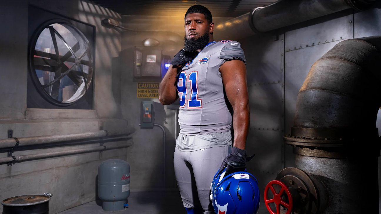
It really shouldn’t be so difficult to come up with unique twists on NFL uniforms that still look good, but here we are. The Buffalo Bills released their new alternates for 2026 on Monday that they’re calling “Nickel City,” presumably because it cost them five cents worth of AI tokens to design it.
The whole “ode to blue-collar workers” is fine — but making it a literal blue collar on grey is a little on the nose. These look far too much like the Detroit Lions uniforms with some red piping that doesn’t evoke the Bills at all. In addition, the cool grey, plus blue, plus red is a custom uniform I would have designed in Madden 06 back in the day and thought it looked absolutely fire, despite being a total eyesore.
Bills fans absolutely hate these, and it’s understandable.
Then there’s the helmet … oh, the helmet. The red streak is supposed to evoke the speed of a charging buffalo, and that’s been the iconography since the 1970s. The issue is that they took just that line, put it on the helmet, and accentuated the origin point of the streak. As a result it looks as though the Bills have created the first uniform in NFL history that depicts a butt farting a stream of blood.

Perhaps that’s just my reading, because I really miss eating salad without fear of explosive butt problems.
Ultimately, this whole uniform is just a mess. The designers took the easiest, simplest, cleanest three colors in sports: Royal blue, red, and white — then added grey and kept ALL OF THEM to make a muddled mess. This is an affront to the senses, and I know Bills fans roll deeper than anyone in the NFL when it comes to the love of their team, but even y’all have to boycott buying this debacle.
What's Your Reaction?
 Like
0
Like
0
 Dislike
0
Dislike
0
 Love
0
Love
0
 Funny
0
Funny
0
 Angry
0
Angry
0
 Sad
0
Sad
0
 Wow
0
Wow
0