
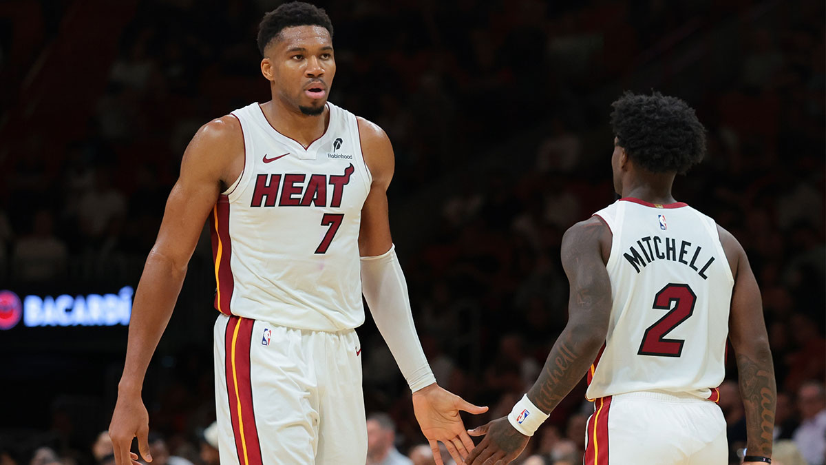
NBA Cup Court designs are often polarizing. Every team wears vibrant, unique jerseys during in-season tournament games that are both meant to be standoutish and represent the city of the team donning them. The courts are supposed to match. However, some NBA Cup courts have historically been a nightmare.
They can distract from gameplay or just look plain ugly. This year, while NBA Cup court designs were notably more simple than normal, the Miami Heat stood out as having the worst design for their playing surface. So, why did Miami miss the mark?
The Heat have the worst NBA Cup court

In the past, everyone has looked forward to what crazy designs and colors the Heat would rock on NBA Cup games or with their alternate uniforms. The team's famous blue, pink, and black “Vice City” jerseys, for example, are some of the most beloved threads in NBA history. Just last year, the Heat ranked as having the fourth best City Edition jerseys.
Of course, not everyone will like such an in-your-face design, but the splashy history fits the city of Miami well. In 2026-27, though, the Heat somehow have arguably the most boring and bland NBA Cup court design. For starters, the yellow base color looks more like your standard hardwood than anything that is supposed to draw fan's eyes.
Article Continues BelowPlus, it is hard to make out the NBA Cup trophies at center court and in the lanes because of the base color. Furthermore, the out-of-bounds areas are a simple plain black. Other teams used bold color choices, or, at the bare minimum, patterns and designs on the baseline/sideline out-of-bounds. The Heat went with nothingness.
Everything about this NBA Cup court feels bland, and that is only enhanced by the Heat's vibrant history. Miami has the worst courts in the league.